If you are planning a wedding with clean and simple details, that does not mean you have to skimp on your wedding stationery! Your wedding invitations are a great way to set the tone for your wedding day and give your guests a glimpse into what they can expect at your celebration.
Opting for a clean and modern look to your custom wedding stationery design can allow you the opportunity to play with textures and shapes or even a pop of color while still keeping that elegant and luxurious look.
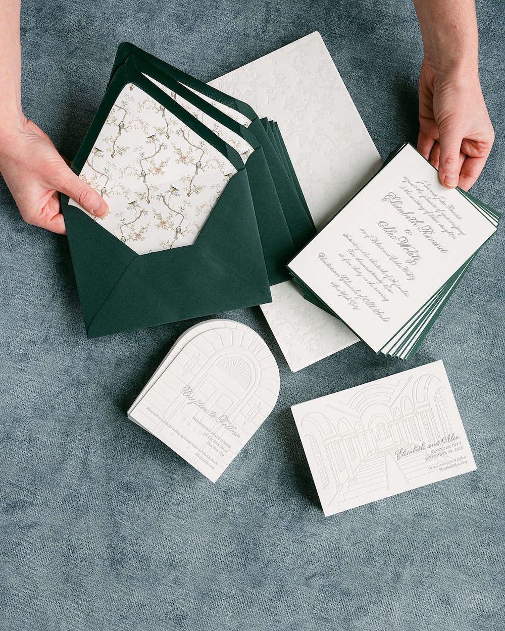
For their fall wedding in New York City, we were honored to work with our couple Elisabeth and Alec on a modernly fresh wedding invitation suite that featured racing green and white colors with letterpress, thick paper, hand calligraphy, and custom artwork with an organic, nature-inspired design.

Timeless Elegance Detailing
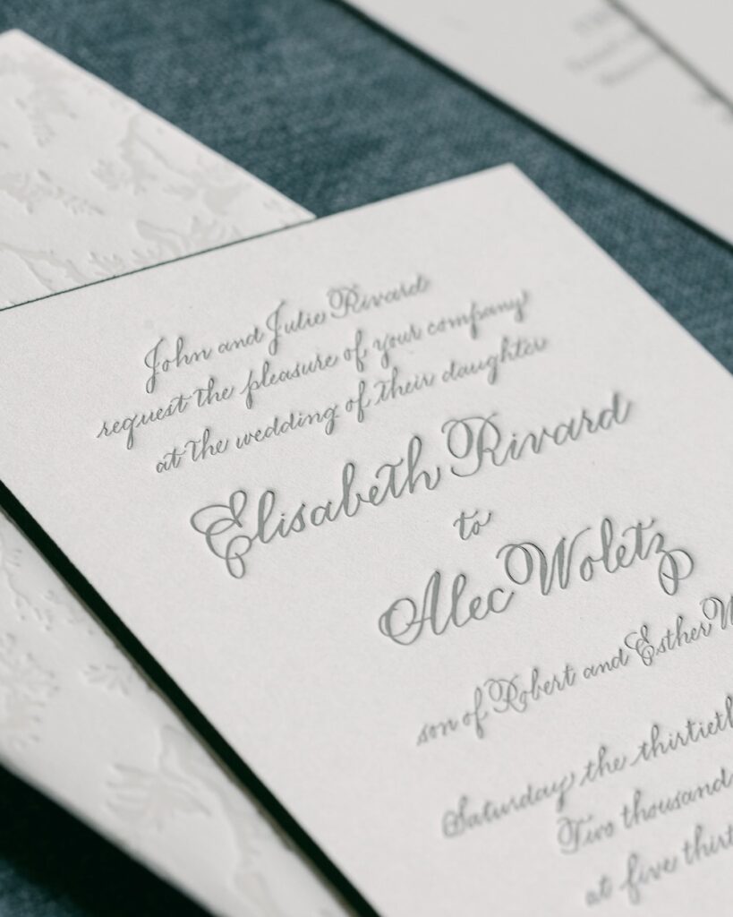
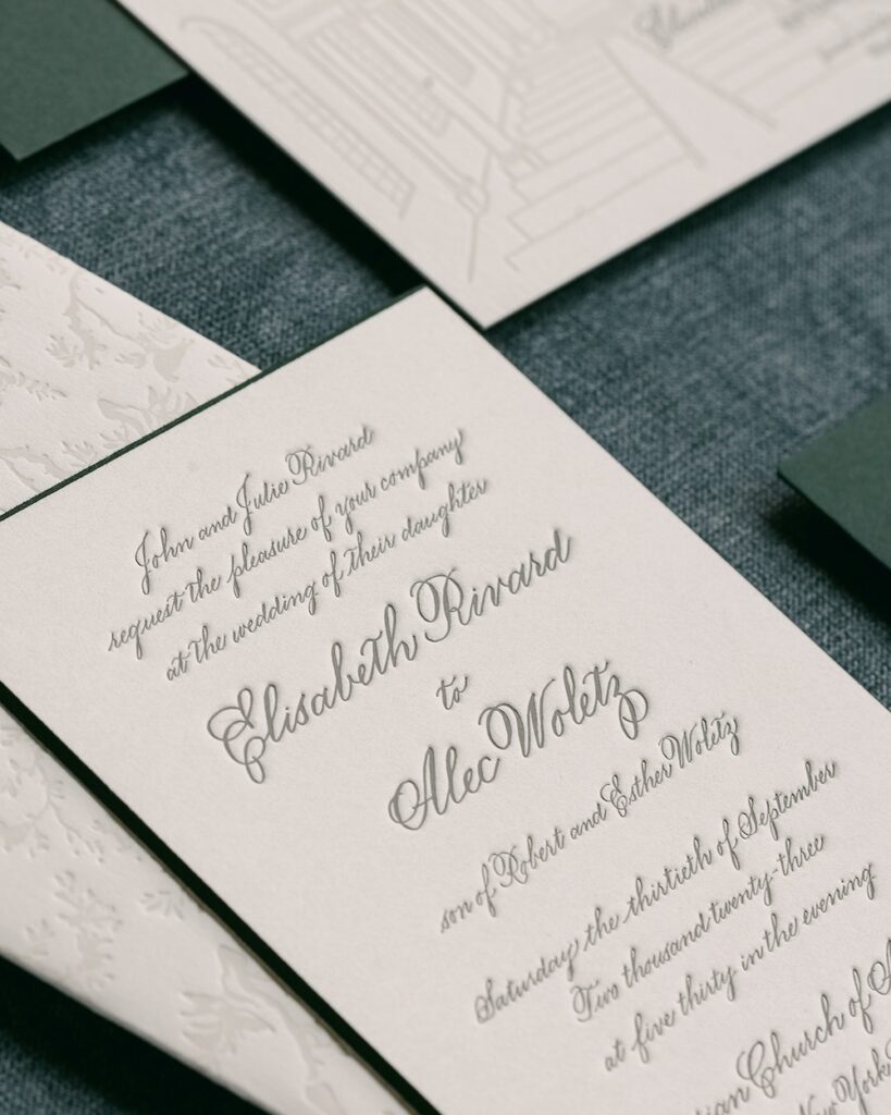
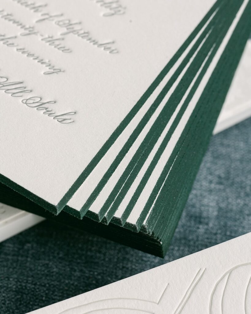
Elisabeth and Alec wanted classic design elements for their custom wedding stationery suite for their autumn wedding in New York City that paid tribute to the city but also had a relaxed but elegant feel with nature-inspired elements. Letterpress detailing allowed for clean and modern lines and opting for an extra thick cardstock added to the luxury feeling of the entire wedding invitation suite and day of the wedding paper details.
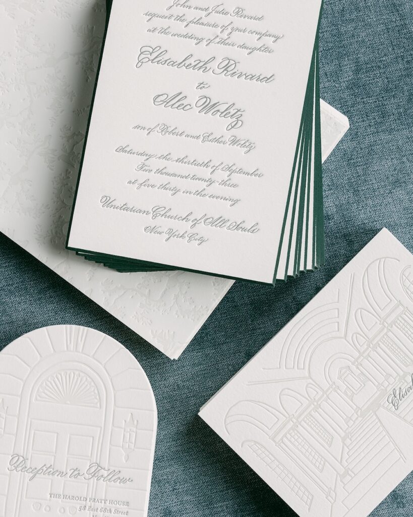
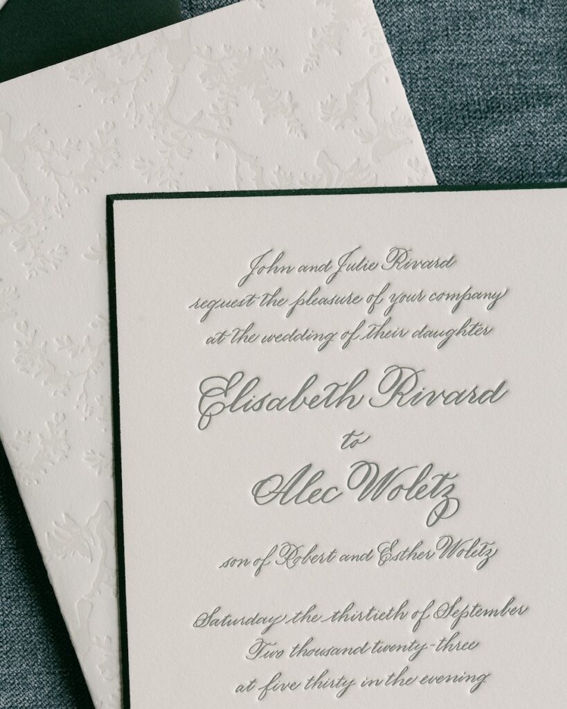
The main wedding invitation card was a 3-ply letterpress card with a racing green colored beveled edge. The thick paper choice allowed for the playful peek of color that matched both the wedding invitation envelopes and reply envelopes. Opting for a thick cardstock also gave us the opportunity to add extra detail and dimension to the back of the wedding invitation card, adding a blind deboss wrap in a floral pattern with birds.
Many couples may not even think about the backsides of their wedding stationery, but these extra details can really elevate a wedding invitation to the next level, and we were so happy to add this extra touch to Elisabeth and Alec’s custom design.
Unique Envelope Liner Art
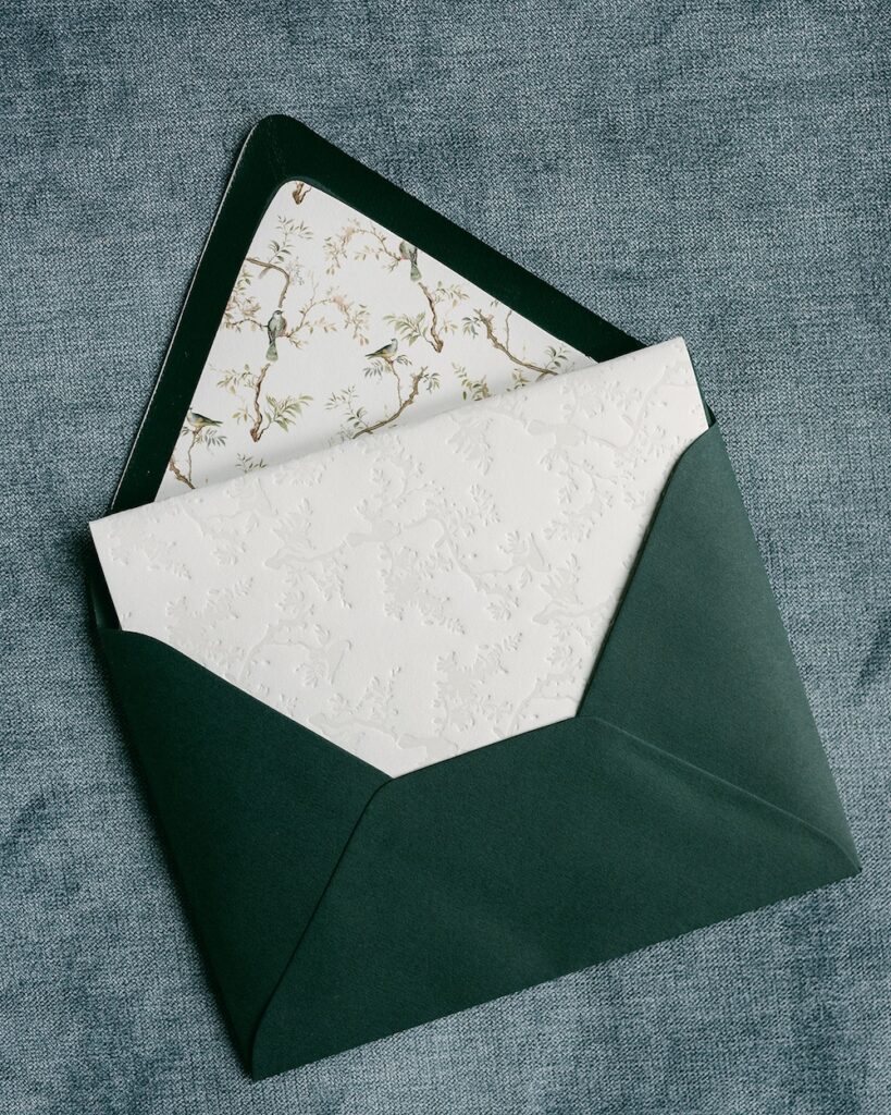
Another place that many couples may not think about when it comes to designing their wedding invitations is the envelope liner. This is another great place to add some personality and flair to your wedding invitation suite and make your invites stand out.
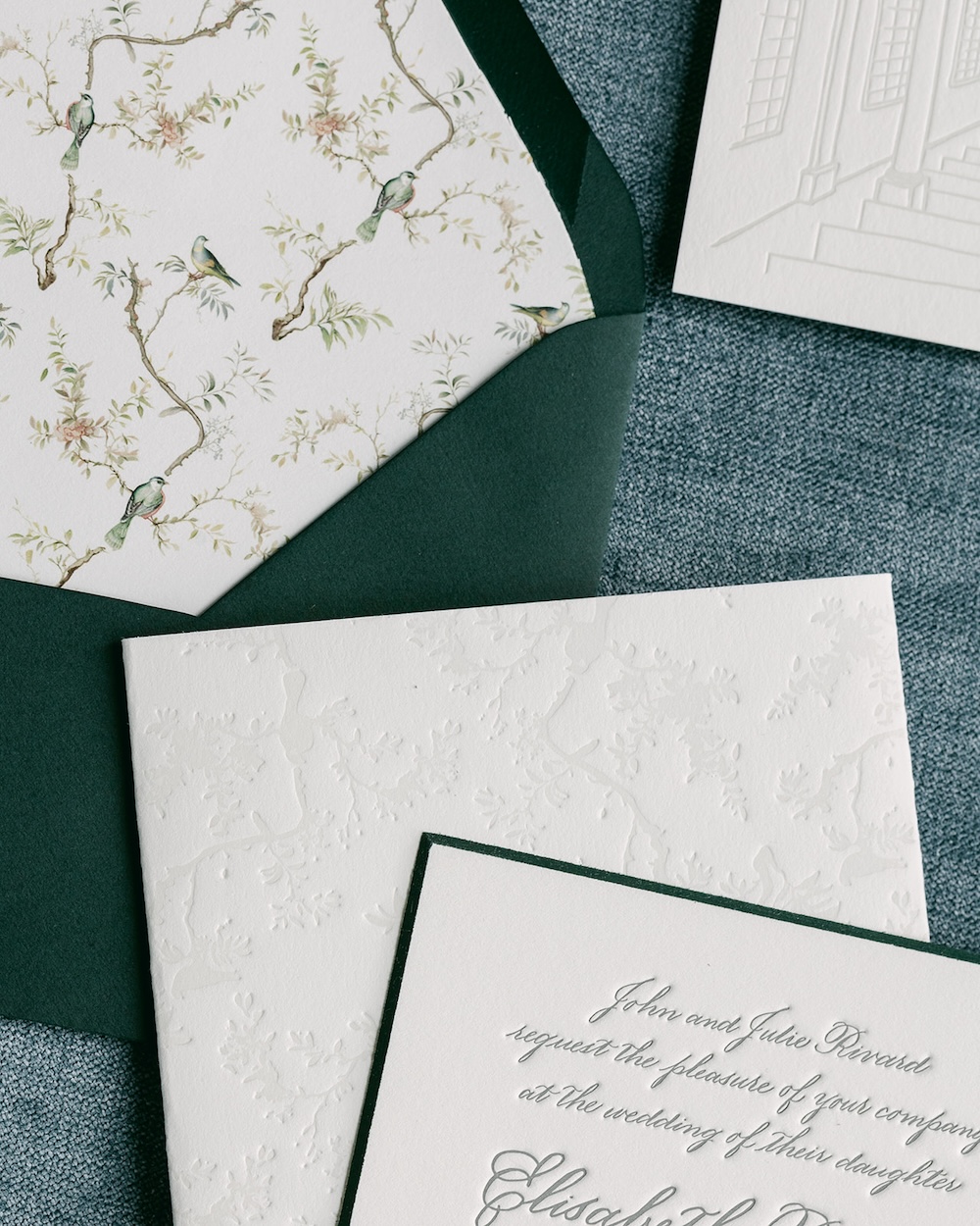
We worked with Elisabeth and Alec to create a custom envelope liner art featuring birds and tree branches. This full-color artwork was a great way to add a bit of color and interest to the overall clean invitation design.
Custom artwork for your wedding invitations is a nice and elegant way to help tie the other details of your wedding day together. This same artwork that we used on the envelope liner was repeated in a blind deboss pattern on the back of the wedding invitation cards for a bit of texture. The colorful motif was repeated on the edges of the reply cards and wedding day menu cards.
The custom artwork made an appearance on the wedding day too in some of the day-of paper details. We used it on the place cards for each wedding guest at their place setting at the reception.
Letterpress Detailing
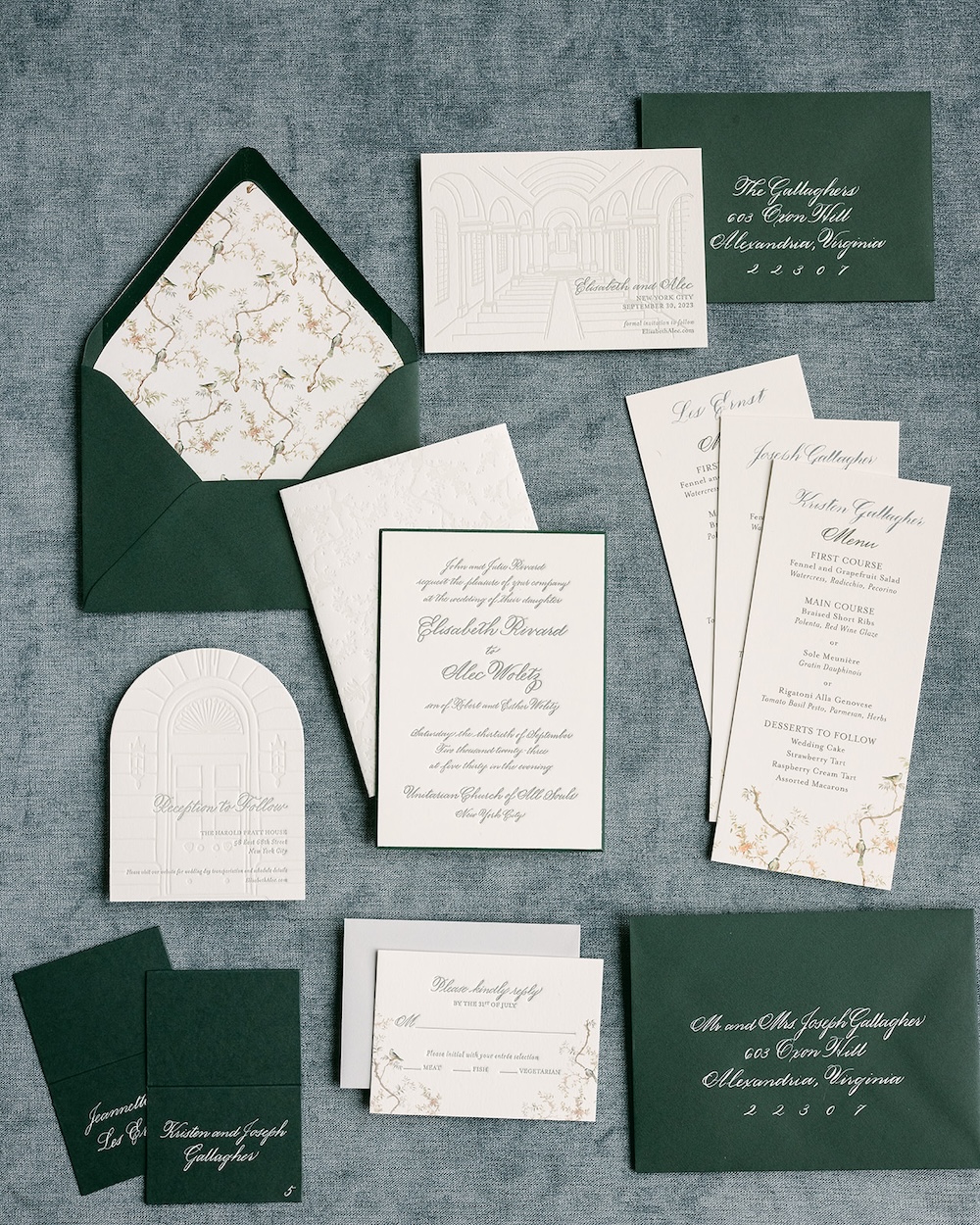
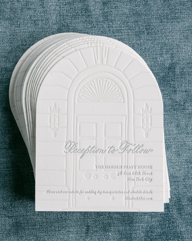
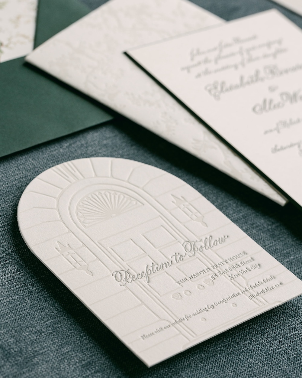
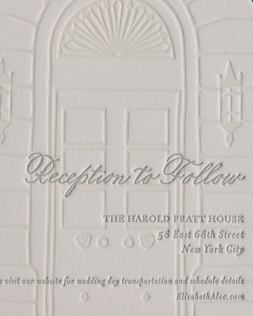
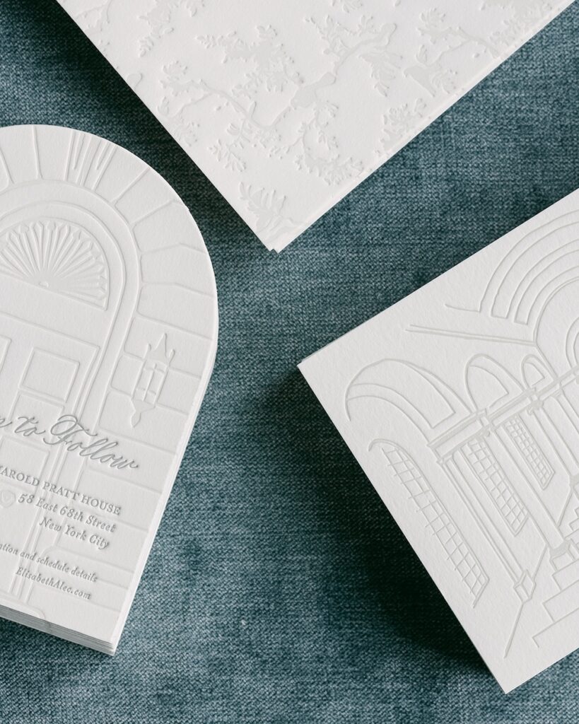
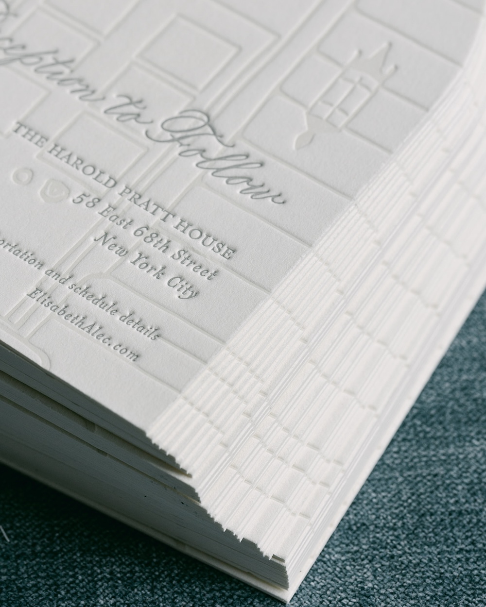
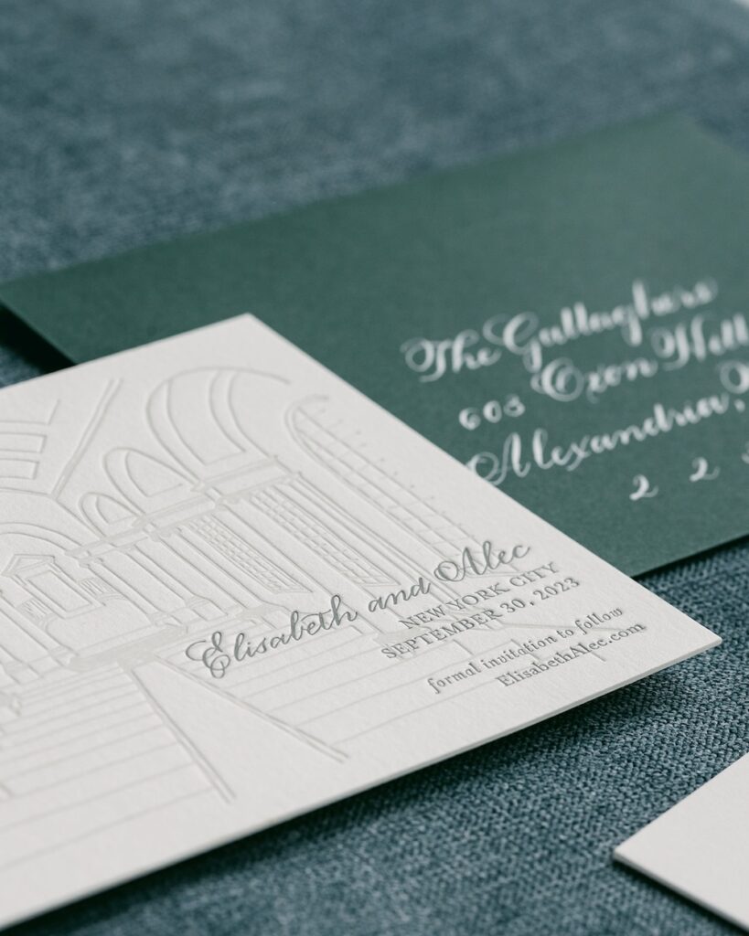
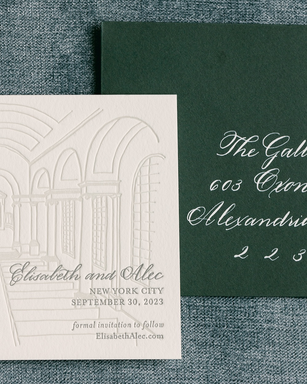
The luxe, thick cardstock used in this custom wedding stationery set allowed us to add some fun letterpress detailing. Both the wedding’s save-the-date invitation and the wedding reception details card featured letterpress artwork that reflected the couple’s NYC wedding venues.
Adding this linework art is another way we were able to personalize this wedding stationery and add a unique detail that is anything but a cookie-cutter wedding invitation design.
The rounded edge die-cut reception card added a bit of visual interest to the otherwise rectangular cards.
Pops Of Color
Opting for a sleek, modern wedding invitation design doesn’t mean you can’t have some color! We love a pop of color to add a little personality and to help your wedding invitation stand out. The invitation’s envelope is a great place to add a little color to your wedding stationery if you want to keep your invitation’s design more clean-cut.
Elisabeth and Alec chose a classic racing green color for their wedding invitation envelopes and reply card envelopes that added a fresh pop of color to their white and grey invitation design. This shade of racing green was perfect for a modern autumn wedding in New York City.
We added our signature hand calligraphy in an elegant script font using white ink that added a clean contrast of white to the overall design that allowed the gorgeous calligraphy to stand out.
A special thank you to Sarah Bradshaw for photographing this elegant yet simple personalized wedding invitation suite with green, white, and a nature-inspired design details that we custom created for an autumn New York City wedding.
To learn more or to inquire about your own custom wedding stationery or wedding branding needs, please visit the weddings section of our website.